Voted the best company to work for by the Sunday Times in 2020, the MVF Global team has also won two Queen’s Awards for Enterprise. With an energetic drive and strong vision, the company has developed a customer generation platform used by ambitious organisations internationally.
MVF engaged our team to create a wayfinding scheme that would drive employee engagement and reflect their brand as they expanded into new space, in conjunction with a post-COVID return to the office. The brief was to develop a scheme that embodies the company’s focus on its employees while complementing the forward-thinking, open plan workspace.
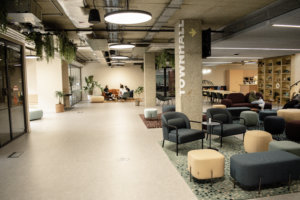
This project took place in vibrant Hoxton in the East End of London – a neighbourhood packed with art galleries, stylish restaurants and green spaces.
Working closely with the client through a series of workshops, Cobal advised on several aspects, including materiality, feasibility, wayfinding and zoning. Assessing how employees and clients move through the two-floor open-plan space, we identified areas of interest and advised the client on how the signage design could become integral within the space.
During the initial discussions, it was clear that ‘traditional’ signage materials such as metal and plastic would not complement the space or brand, so our designers worked closely with the client team to identify suitable alternatives.
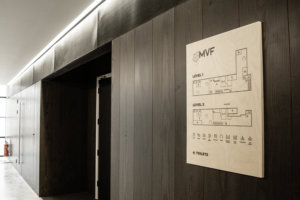
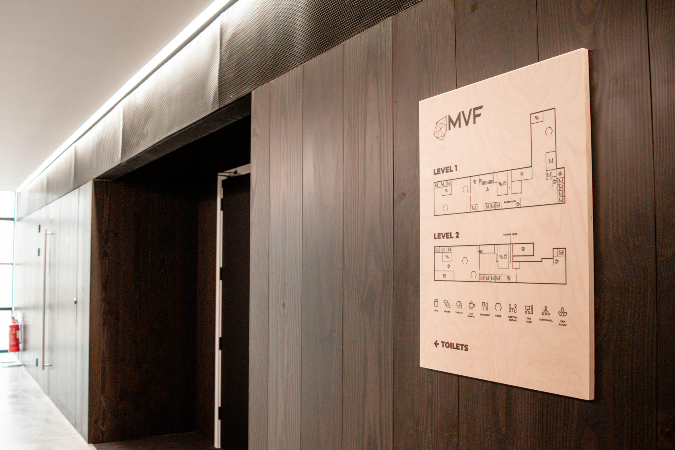
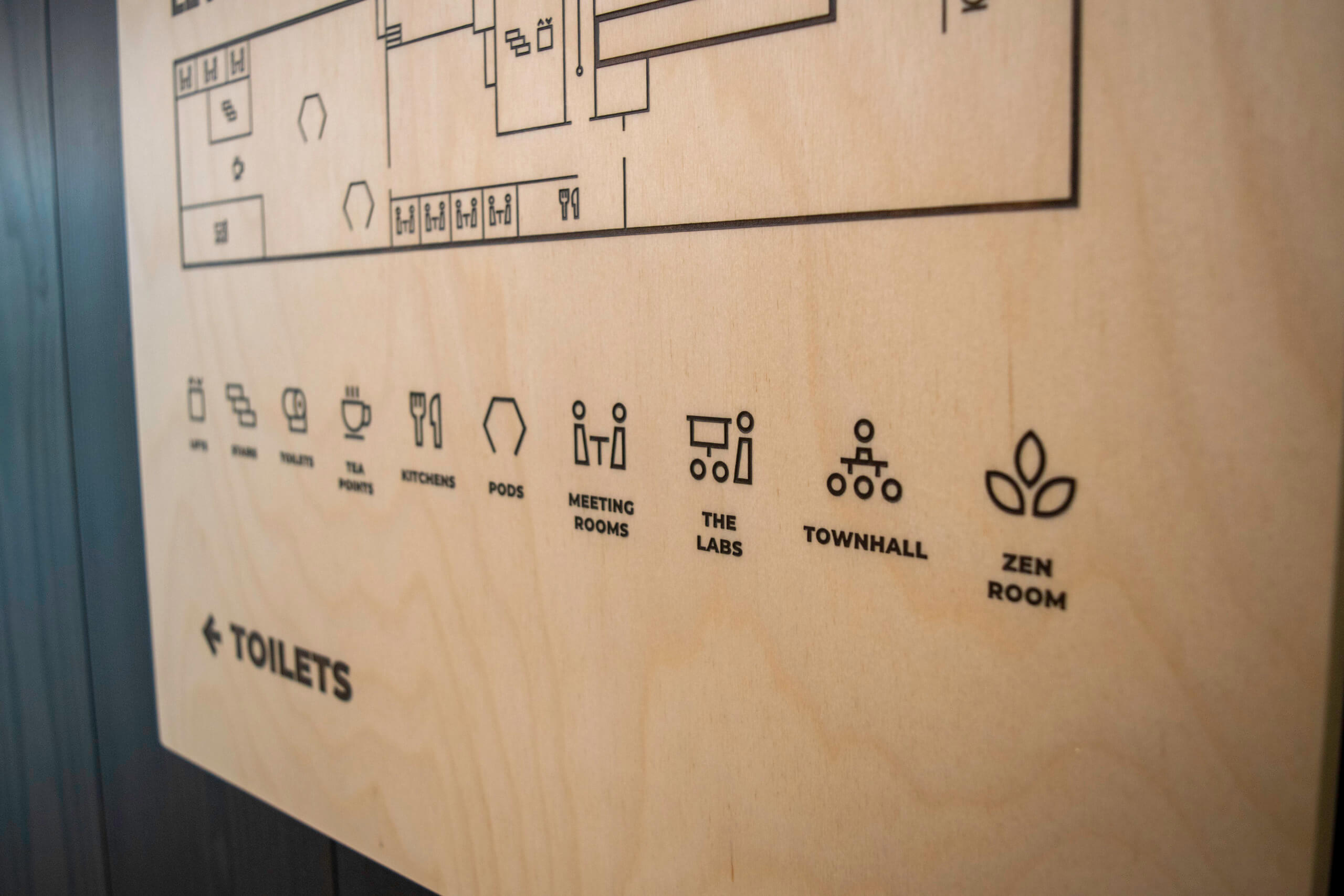
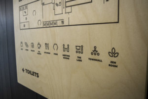
Sustainably sourced Birch Plywood was the perfect material choice for floor identification signs. Allowing the natural grain of the wood to show through, the panels were laser-etched before being skilfully infilled by hand with brown translucent ink to create a captivating burnt effect.
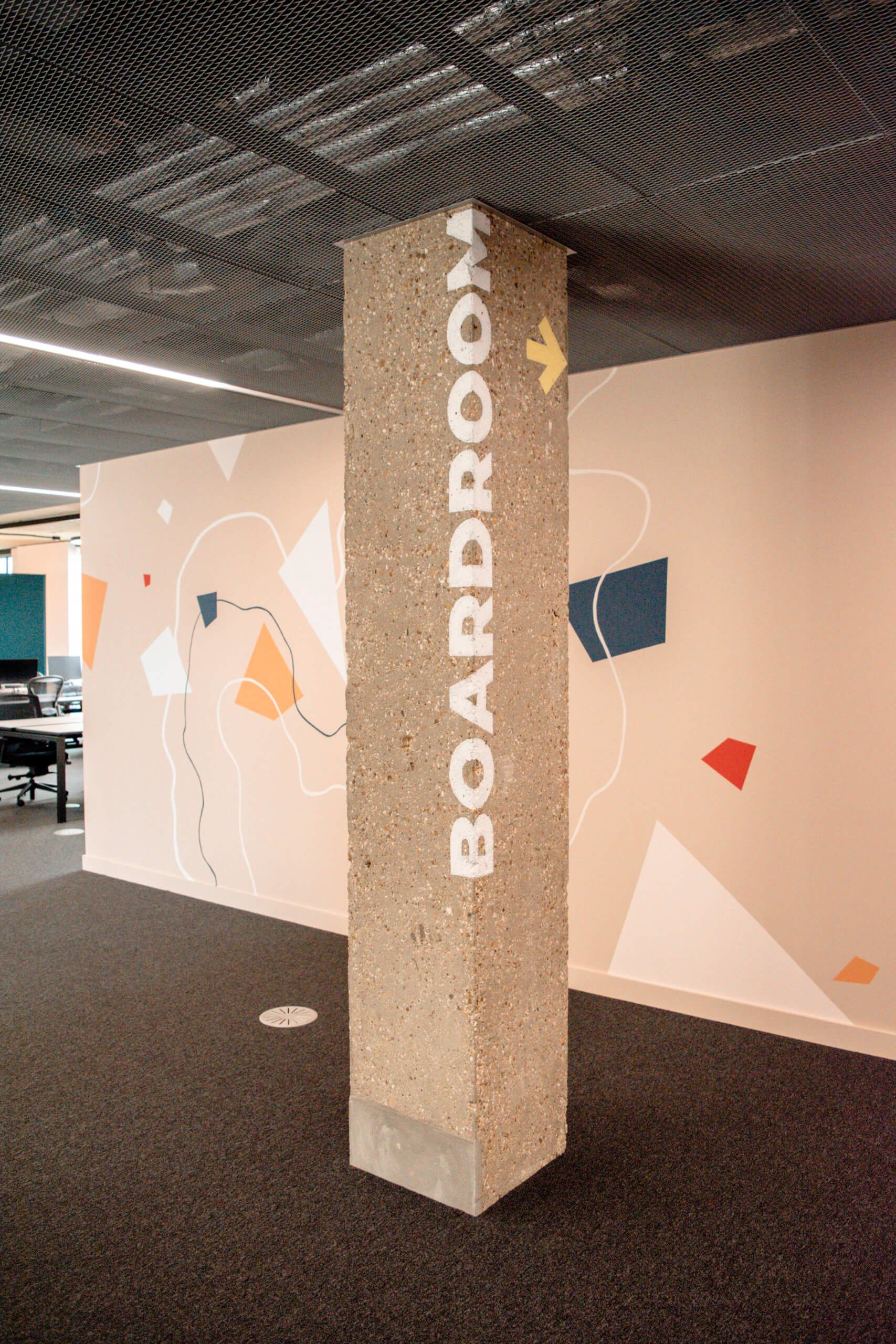
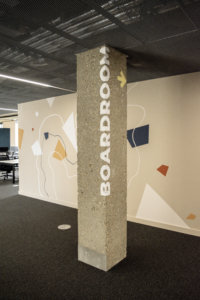
MVF wanted to utilise the exposed concrete pillars that pepper the space for the wayfinding, this posed a challenge not only due to the roughness of the surface but also due to the fact the Landlord had stated any signage must be fully removable so as to leave no trace for any future tenants. To solve this dilemma, we specified hand-painted lettering using a semi-permanent, fully removable paint product. Wraparound text sets are sign written at strategic locations around the site, helping to create a warm and open atmosphere whilst respecting the original architecture of the building.
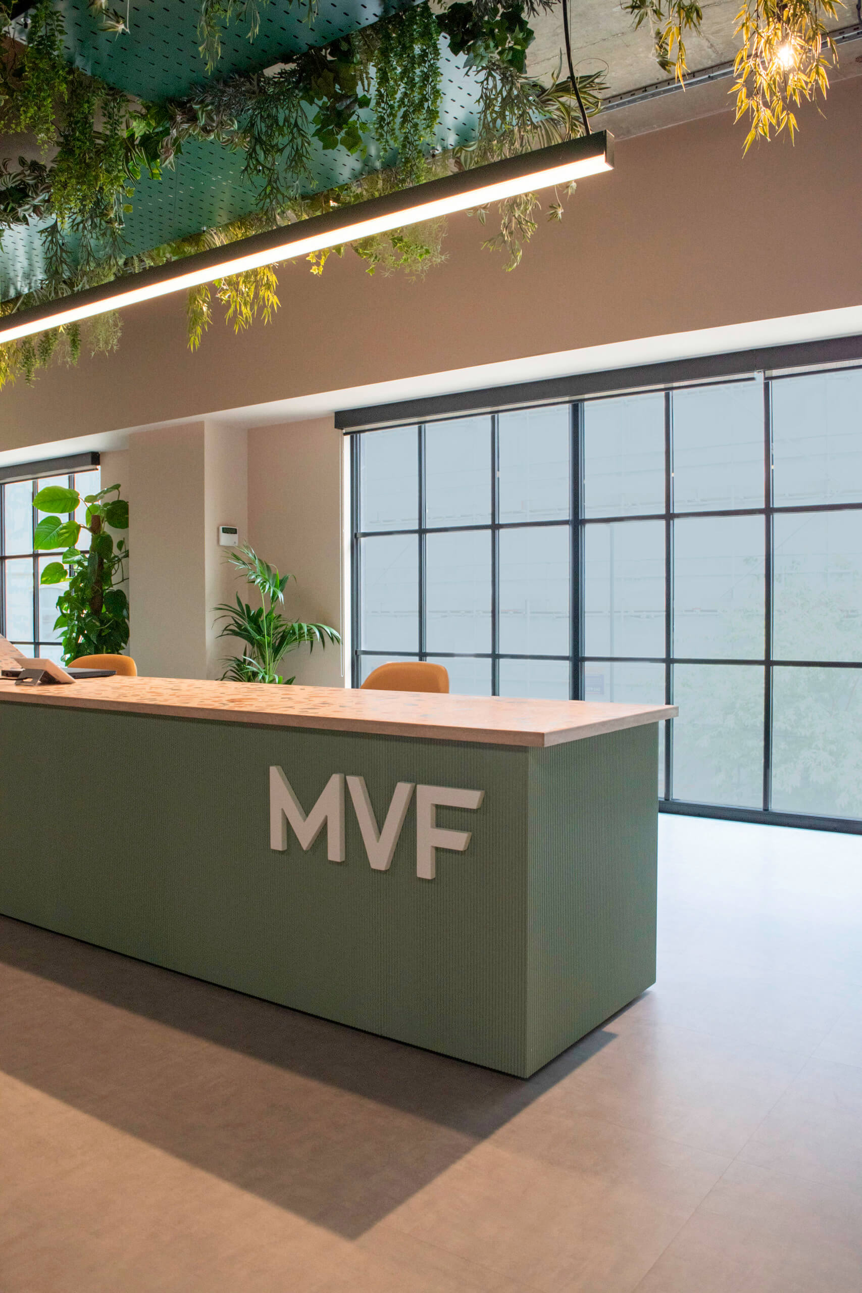
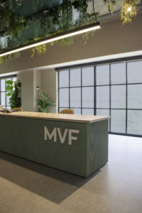
Large directional graphics blend perfectly within the environment, guiding people and creating a natural flow. The bespoke reception desk was finished with a striking MVF logo crafted from Valchromat and finished with a satin hue. The scheme was completed with vinyl meeting room graphics capturing the quirky workplace culture, with room names such as Unicorn, Happy Whale and Ladybird Lake.
Reflective of how MVF connect customers and clients, the finished scheme connects their team to the space, creating the perfect environment for productivity, collaboration and fun!
Client: MVF Global
Fit-out: ISG Agility
Services: Internal bespoke signage and wayfinding, environmental graphics, and placemaking elements.
