canopy by Hilton
Client:
4C Hotel Group
Location:
Aldgate, London
Services:
Internal Signage and Wayfinding, Design, Consultancy & Management
canopy by Hilton, the first of its kind in the UK. The design of this stunning new hotel in East London was inspired by the area’s history as part of the textile industry; it pays tribute to the Huguenot silk weavers who established themselves in Spitalfields in the 17th Century.
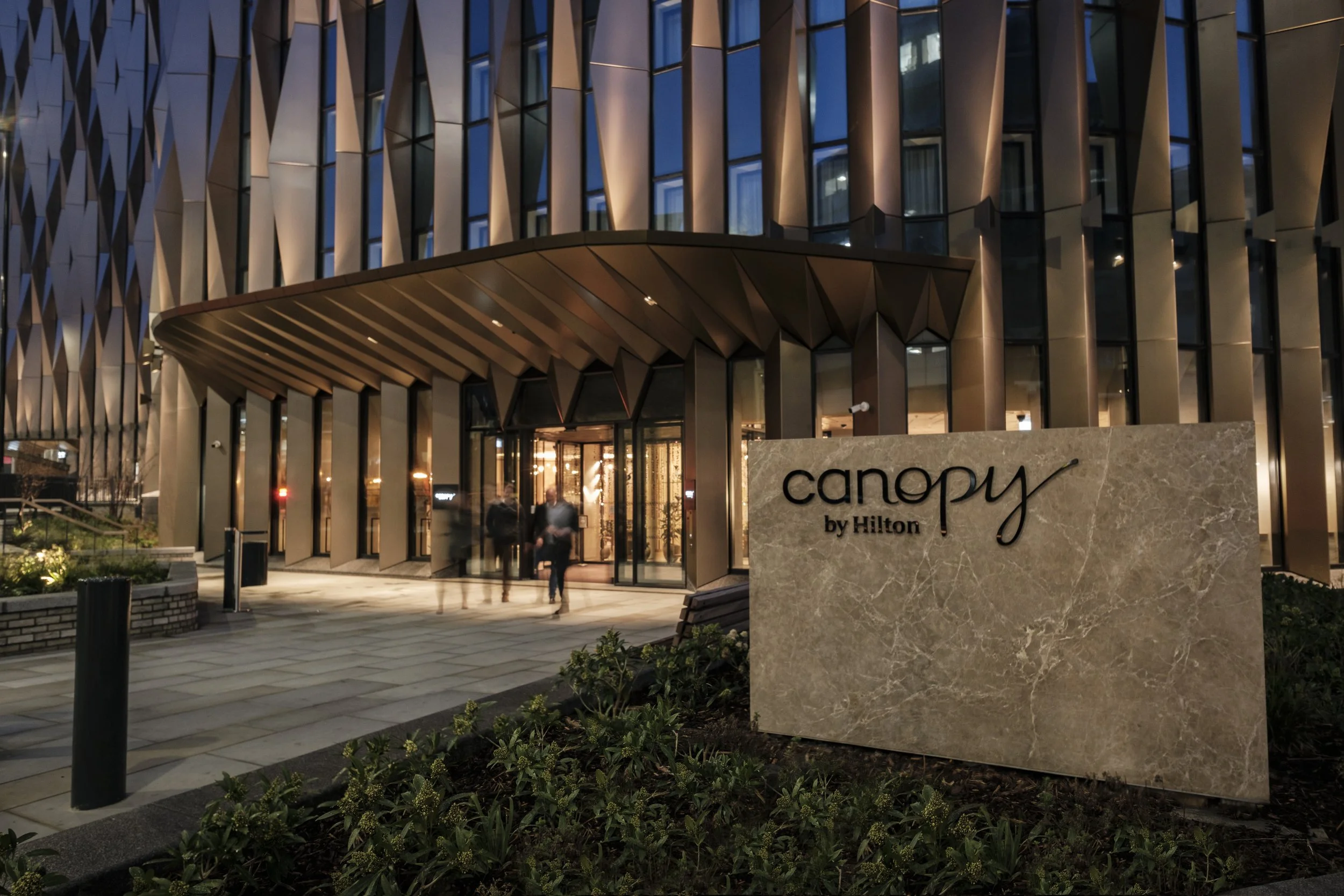
As part of Hilton’s Travel with Purpose 2030 Goals for sustainability, this hotel revitalised a 1970s office block in Aldgate, reducing its impact by giving an existing building a new lease of life, and reducing the hotel’s environmental impact.
The hotel is part of the multimillion-pound regeneration of the area in East London, and its proximity to the city centre makes it an obvious choice.
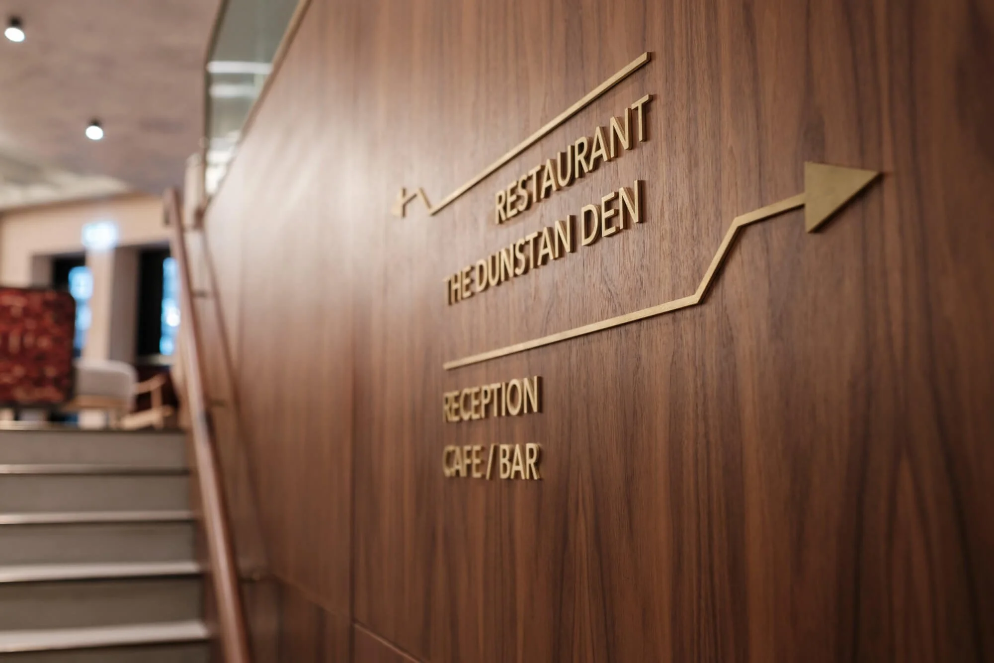
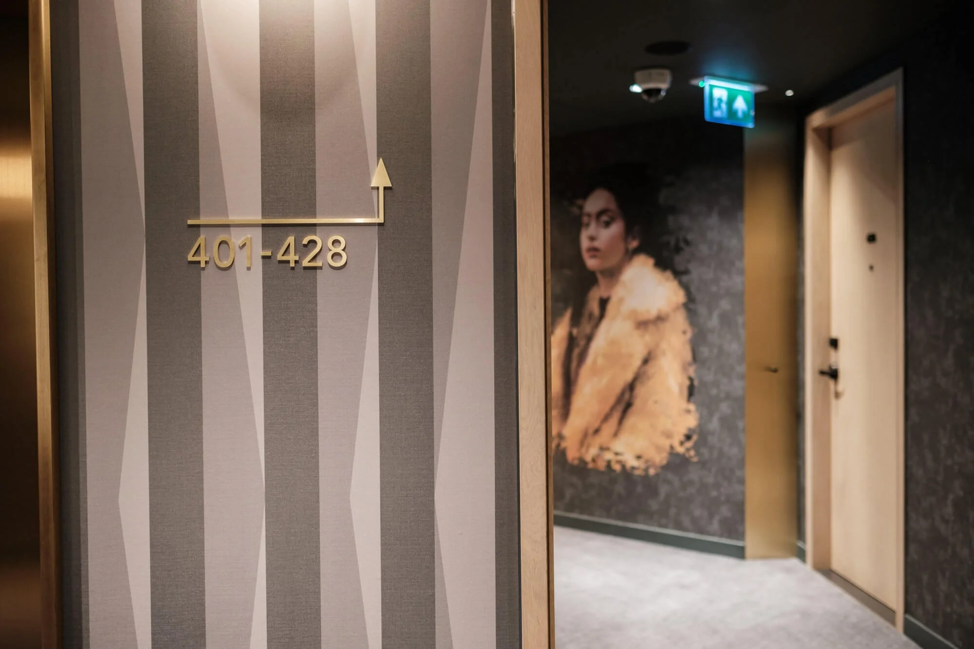
canopy oozes luxury and thoughtful design. As you enter the lobby you are met with brushed brass wayfinding lettering and iconography, the sharp lines of the laser-cut metal sit beautifully against the mottled concrete render of the walls.
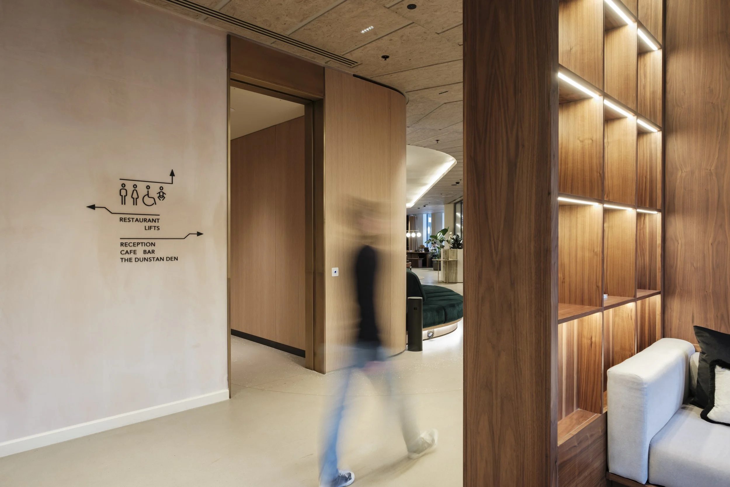
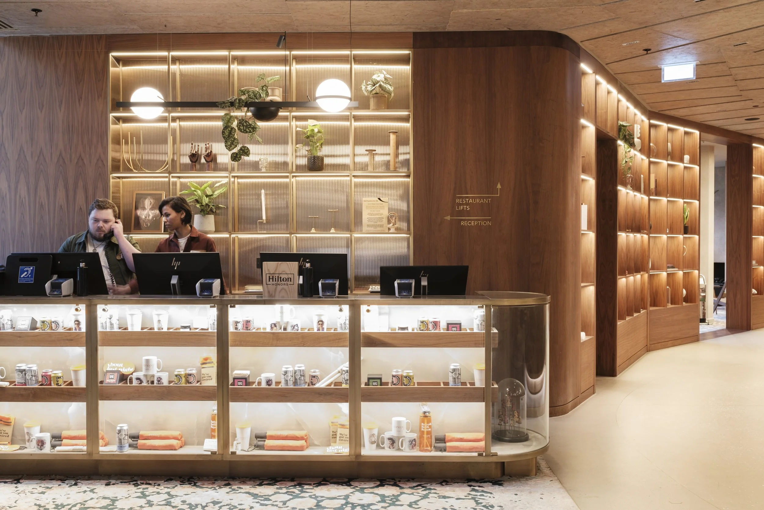
Bold art and dark, rich woods paired together with art deco furnishing and interior design create a space that feels like you’re treating yourself for your weekend getaway.
For the wayfinding design, we partnered with Jackson Daly; he devised a concept surrounding the Avenir typeface, geometric but still with an organic form, for this canopy Hotel. This idea is represented in the wayfinding symbols themselves; clean lines with a touch of curve and a natural flow to them.
The materials used for the signage remind you of the mechanical side of its textile inspiration. Brushed brass, antique copper and weathered steel were used through both the internal signage and the wayfinding. Marrying these with rustic hardwood and the muted colours of the soft furnishings create an industrial elegance to the space.
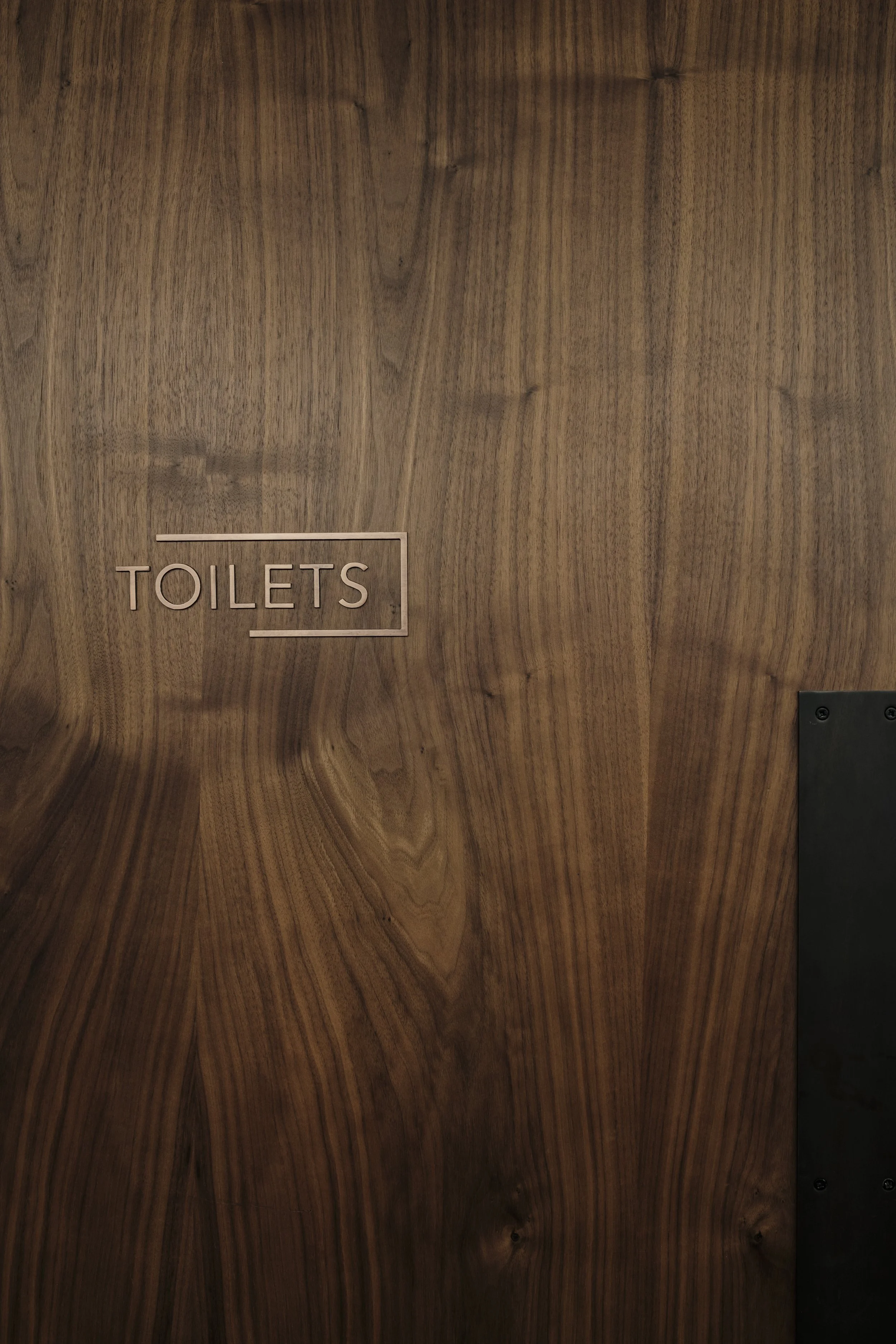
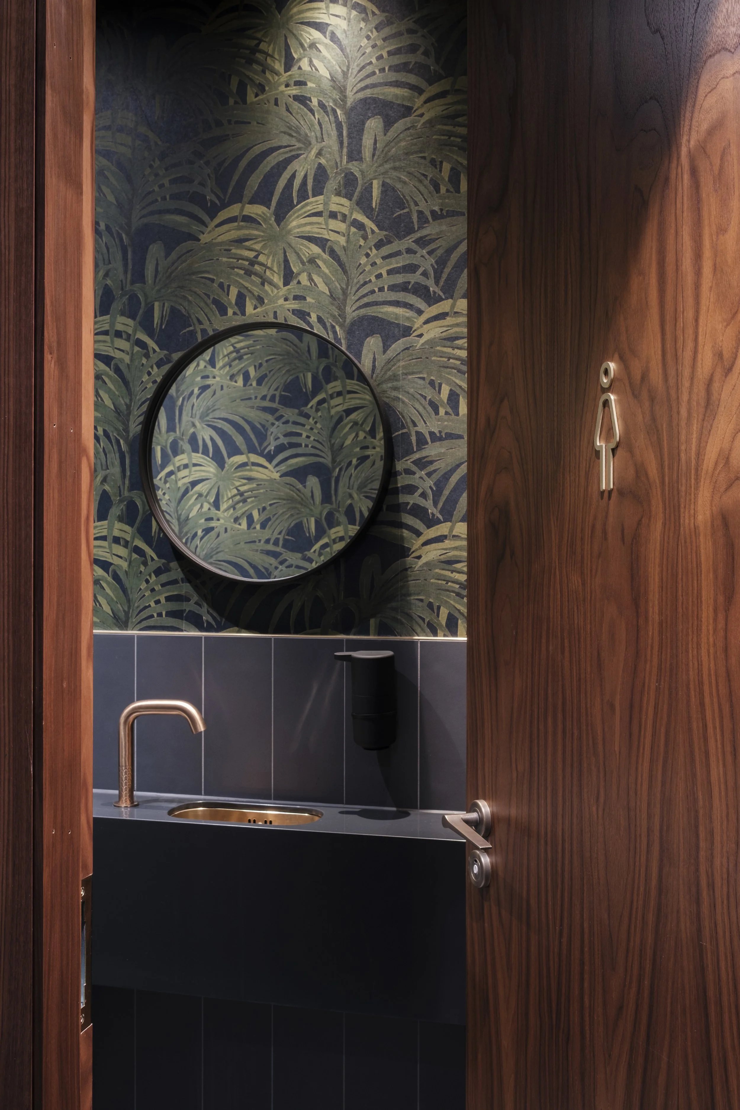
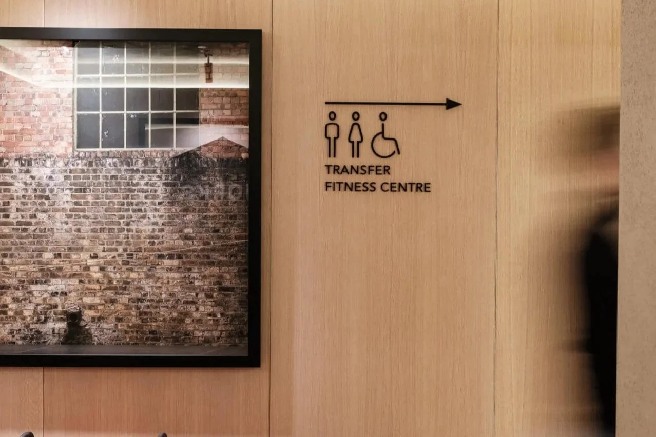
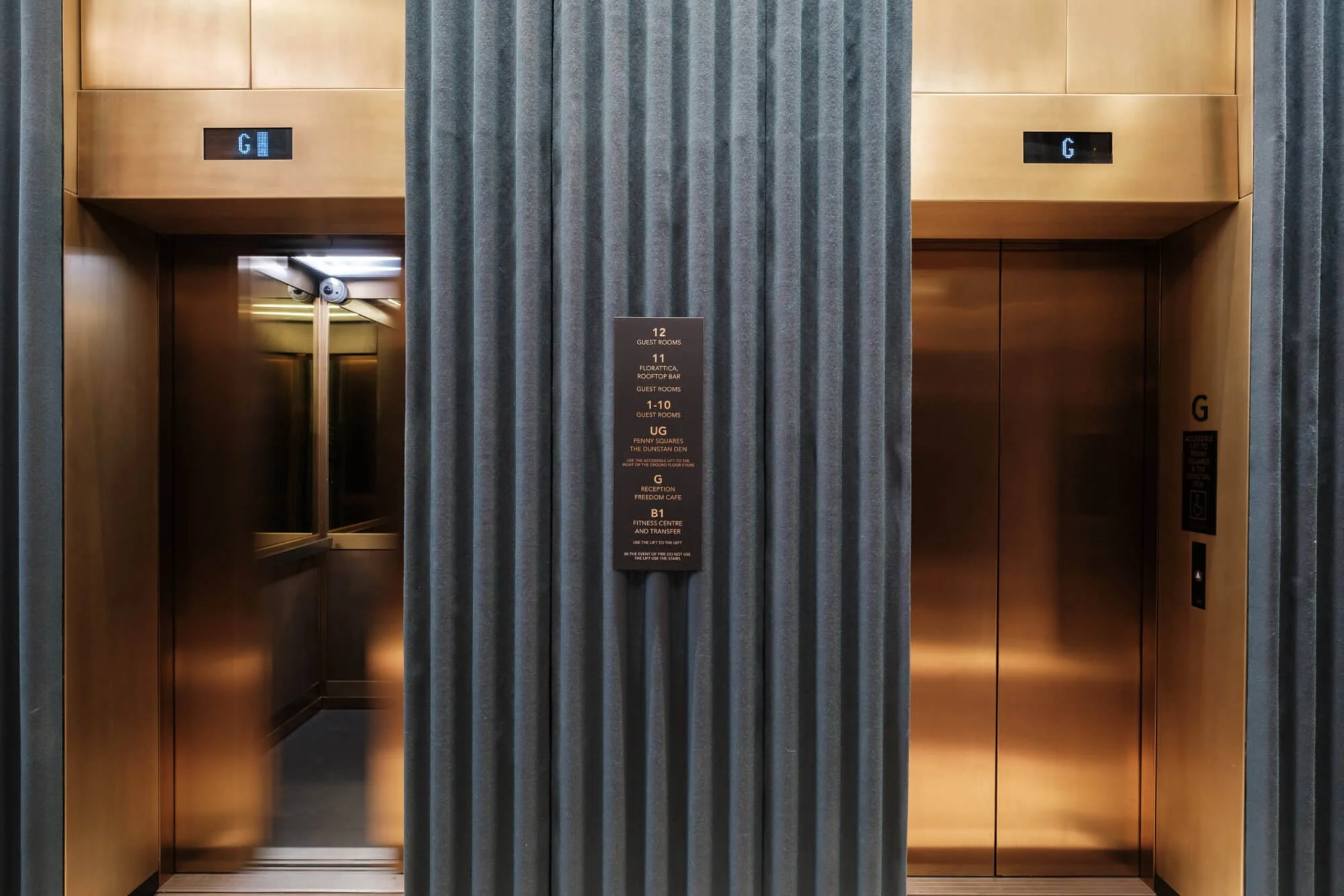
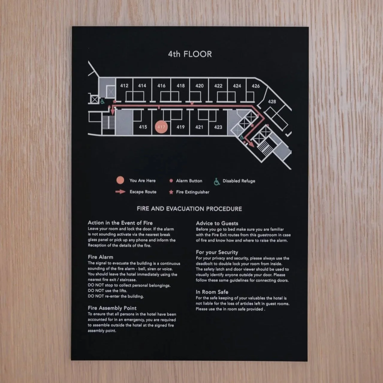
Guiding guests around the hotel are directionals made from matt black acrylic which are mounted flush, creating bold shadows and dimension from the spotlights above. The lift lobby directory was crafted out of a brass panel into which we reverse etched the text and level numbers. Each floor level was finished with a number in the same matt black; continuing the palette down to even the smallest details of the scheme.
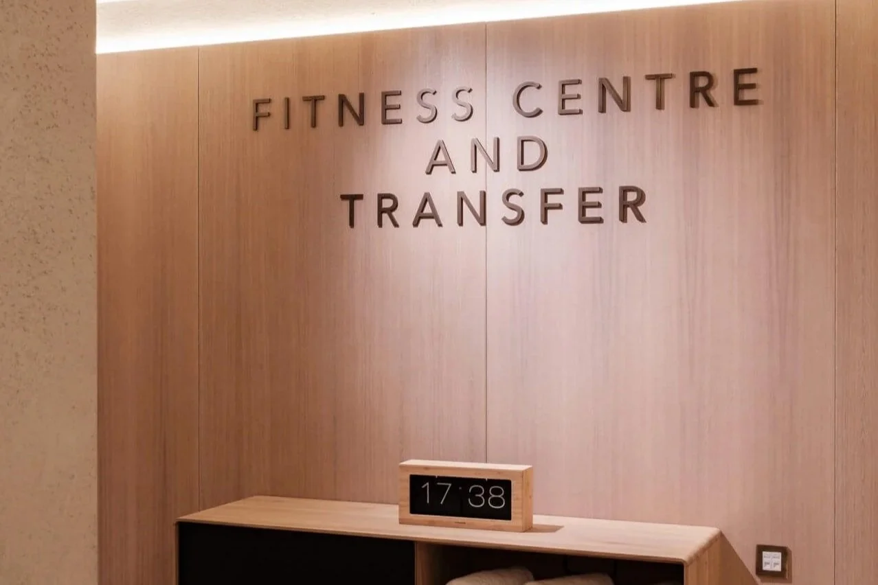
For the entrance of the fitness centre, each letter was laser cut out of dark antique brass. Matching plaques were made for around the centre, detailing health and safety information and other guides such as stretches for patrons to try. This creates a space which is geared towards health and wellbeing, with carefully considered design in each aspect of the interior.
Creative Partners: ACME and Jackson Daly
Photography Credit: Jackson Daly
